

Behavioral Insights: science behind good charts

Behavioral Insights.
This week I found 3 articles worth sharing around data visualization, Google's research efforts, and personalization.
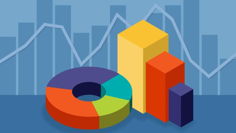
1. The science behind good charts
Communicating data effectively is important, especially in the world of business. We need to be aware of how people read (or misread) visual information to make sure they come to the right conclusion. The Financial Times developed an interactive quiz where you can test your dataviz knowledge. And along the way, you'll learn about the science behind the concepts. [read more - in case you are blocked by FT's paywall, try this search on Google]
2. Google's Research Efforts 2018
Much of Google's research is published openly in top conference venues and scientific journals. In this blog post, they look back at the results of their research in 2018. It covers topics like AI, ethics, natural language understanding, and robotics. [read more]
3. The Dangers of Overpersonalization
Personalization is often seen as a good thing. Showing people only information of interest can reduce user effort and enrich the online experience. In this article the Norman Nielson Group dives into the dangers of overpersonalization and what you can do to avoid it. [read more]
That's it. Have a great week!
— Kevin